In a survey by Custom Neon, 72.2% of respondents said they believe that good signage is more important for a business than social media or newspaper advertisements. Continue reading to learn why outdoor business signs should be a key element in your marketing strategy. There are many elements to consider while designing to attract your target consumers. To produce effective outdoor signage, you should think about colour usage, clear and short messaging, an appropriate call to action (CTA), and location. If you effectively show your brand identity through signage, you should see increased foot traffic, a boost in brand awareness and visibility and even a reach to new audiences.
Understanding Your Target Audience
When designing outdoor business signs, understanding your target audience is crucial. Consider factors like age, demographics, and behavioural patterns of your customers through previous campaign strategies. It all comes down to how memorable your sign is and what the customer will distinguish you by. Outdoor advertisements are your first point of contact, sharing your brand and offers clearly can make a strong first impression, making it more likely for customers to choose your business over competitors.
Location: Busy places require larger/bolder signs to stand out, as well as a catchy initial line or interesting image to ensure that someone looks for a longer period of time and recognises the message or branding displayed on the sign/graphic. A quiet area could use more complex signage as individuals have more of an opportunity to absorb information.
Demographics: What age group or income bracket best represents your target customer? A younger audience may be drawn to bright, vibrant colours or anything comical, whereas professionals or an older demographic may choose a more classic design or subtle humour/graphics. A certain product or message may be relevant to a specific demographic at the time; therefore, your sign could feature the product with appropriate content.
Consumer behaviour: Consider the actions and thoughts of your target audience. Customers may learn a lot about your company from the words you use on your sign. In a FedEx poll, 68% of customers thought a store’s signage reflected the standard of its products or services. Your outdoor signs give a clear indication of what you have to offer. graphics, phrases, and images are used to entice customers to explore the store; emotive messaging is used to make them laugh, smile, or ponder.
Here are some simple but critical business sign tips
Keep your signage clear and concise; you have about 5-10 seconds to convey your message to your consumer. (https://www.flexlume.com/blog/7-business-signage-tips-for-maximum-impact#:~:text=You%20only%20have%20from%20the,in%20that%20window%20of%20time.) In that brief amount of time, viewers should notice, read, absorb, and understand the sign. Make your signs simple by highlighting the main idea or feeling you want to get across.
Choose colours that reflect your brand identity and the message you aim to convey. Consistency in your colour palette across all branding materials is crucial, it could be one main element that consumers relate to your brand and remember you by. Consider the emotions and feelings your colour choices evoke in your audience.
Even before people see your name and brand, they may be aware due to the psychology of colour. Your goal is to evoke in your customer an emotion that is in keeping with your brand, line of products, or current campaign.
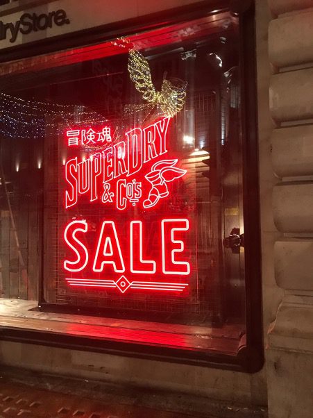
Dynamic and bold, red infuses energy into your retail signage design. Perfect for grabbing attention, especially for a CTA.
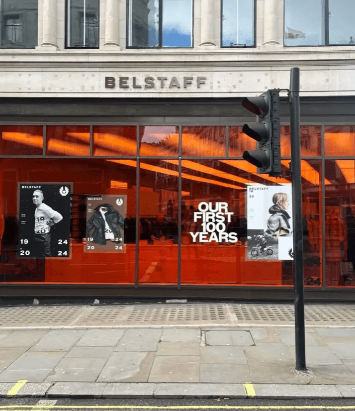
Bright and encouraging, orange adds an optimistic vibe. Use it to highlight key details and bring excitement and energy.
This Belstaff case study is a great example of using orange as an alignment with the celebratory tone and to captivate passersby.
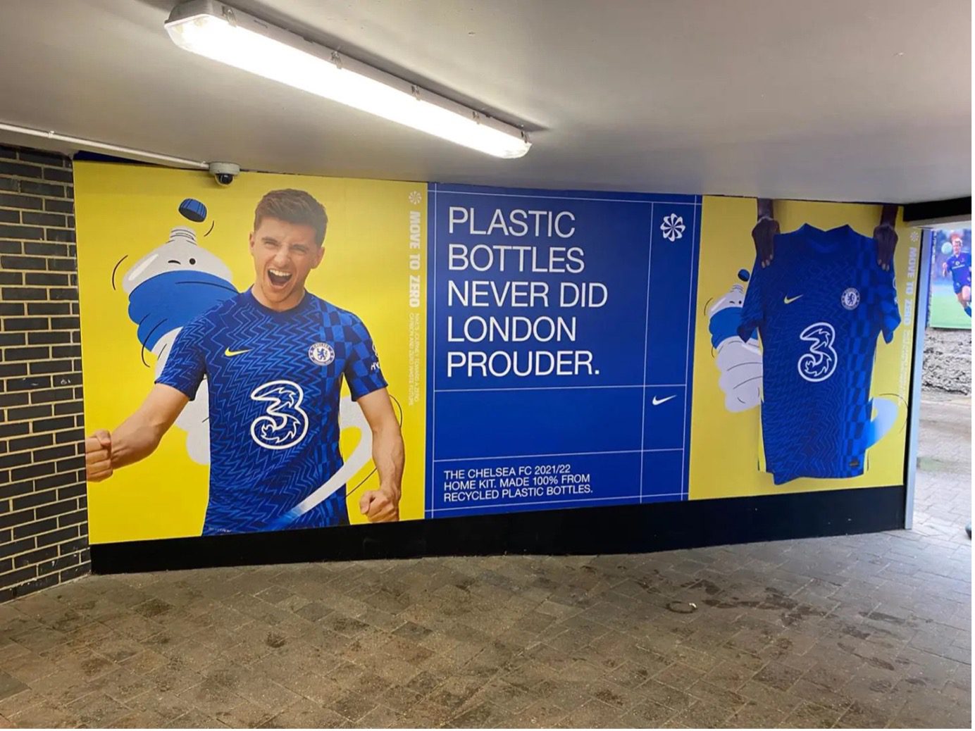
Cheerful and creative, yellow adds warmth and a sense of happiness or playfulness but can also be seen as a responsive colour associated with a ‘bargain’, used for promotions or an exciting announcement from a brand. The Nike graphics we produced for their ‘Move to Zero’ campaign were a great representation of using the recognisable colour of Chelsea Football Club and yellow to showcase the new and exciting announcement.
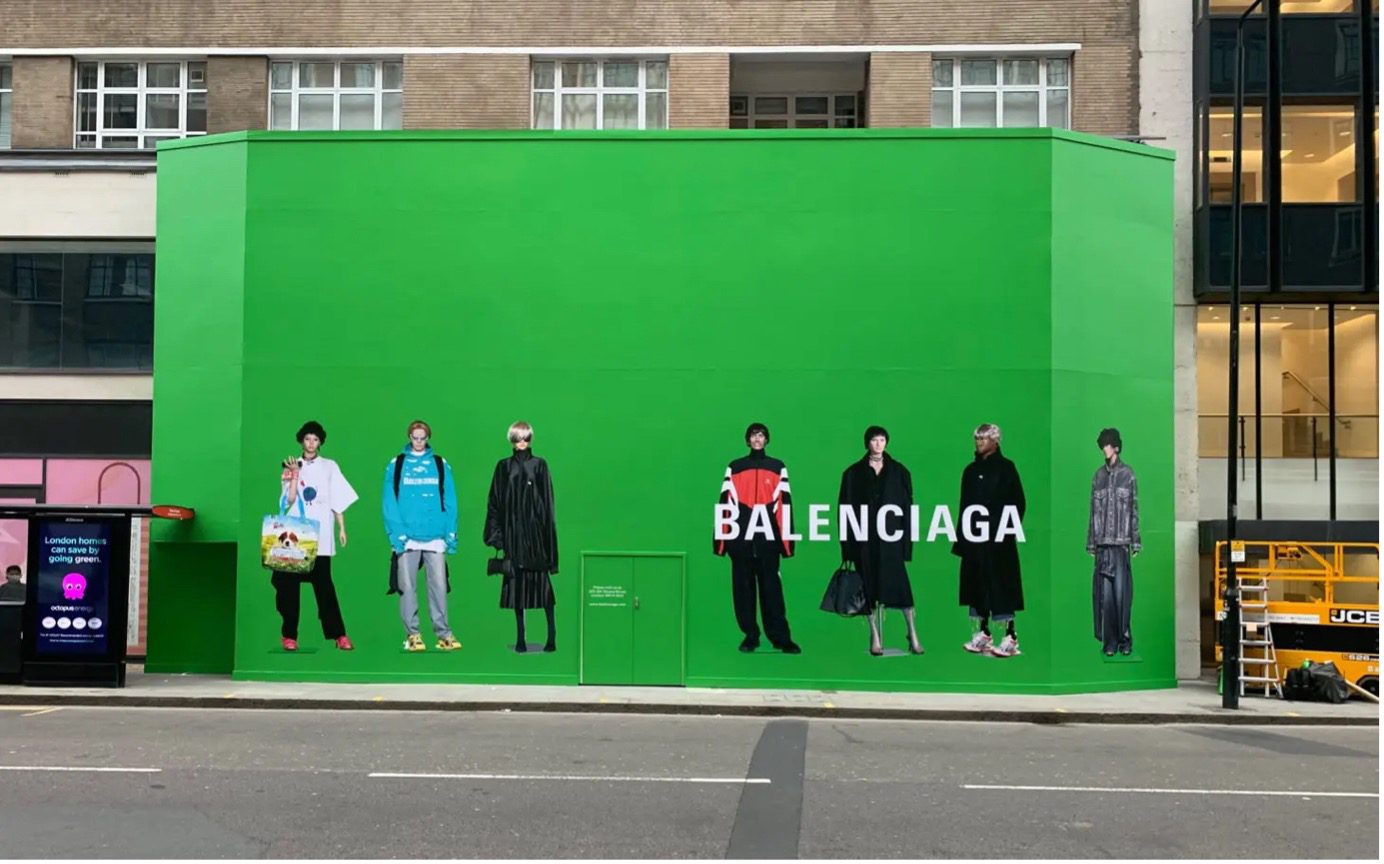
Green is usually associated with freshness or environmental aspects. Darker tones are usually linked with wealth, but lighter/brighter hues evoke growth and newness. This Balenciaga site hoarding was placed in a busy retail location, given the simplicity of the graphics and the small amount of information, but the bright green colour sparked excitement.
Dependable and peaceful, blue adds a sense of credibility to your brand.
Purple adds a touch of mystery and exclusivity to your signage, great for luxury brands. For example, Cadbury’s chocolate is deeply associated with luxury, indulgence, and quality.
Pink brings fun or calmness, depending on the hue. Hot pink speaks urgency which is great for a limited edition campaign or product, while soft pinks evoke a sense of calm and stability. Popular in fashion and cosmetics.
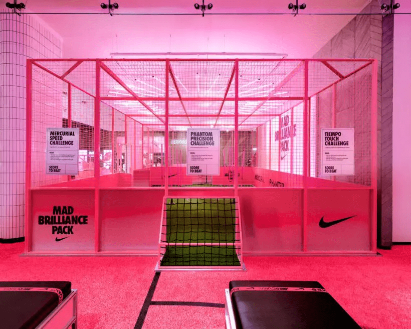
Although not an example of outdoor advertising, this Nike ‘Mad Brilliance’ campaign made full use of this pink and is a great example of colour usage. Nike used this as a statement of confidence, energy, and creativity.
Legibility is important when considering a font. Make sure it is readable from a distance and isn’t overly decorative. As outdoor signage, it is also good to ensure the text is the perfect size, height, angle, and distance, as these all affect the level of impact.
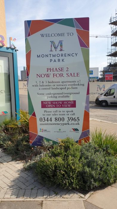
Interactive signage is a great way to get consumers involved. Whether it is a QR code to scan, wayfinding in a creative way or even an interactive hoarding like the one we created for Granville below. Read more about that project here!
Placement and visibility are considerable elements in outdoor signage because they determine how effectively a sign can attract and retain customers. Good positioning ensures maximum exposure, while good visibility, free of obstructions, helps convey your message quickly. To boost conversations and brand visibility try positioning the signs in a high-traffic area.
The design of outdoor business signs should reflect the brand’s personality, values, and uniqueness, ensuring consistency across all marketing materials. Consistency in design elements such as colours, fonts, and logos across all your signage and marketing materials reinforces brand identity, helping your brand stand out in a saturated market.
After asking our design team for some business sign tips they made the following comments…
“Keep it simple, make an impact with colour, and stick to your brand guidelines. I’d also add that it’s important to consider the environment around the signs/adverts so that they contrast and stand out – perhaps add a call to action as well. Oh and high res images are a must!”
“A successful outdoor advertising sign must be visible, memorable, and relevant to its target audience. Ensure the sign is easily seen from a distance, with a clear and concise message, using colour to make it more impactful and visually stand out, typography to complement the overall design while remaining easy to read and following brand identity to maintain a consistent look across all advertising and signage collateral. A well-placed sign which is highly visible and located where there is more footfall will often make it more memorable while adding a call to action would encourage people’s interaction.”
With our expertise in design service, printing, and professional installation, we offer a wide range of solutions to meet the diverse needs of your business.